Designing and Implementing Pepper Flow’s Smart Reference Linking Feature
It started as an offhand comment.
While demoing the original process for adding references in Pepper Flow, a prospective buyer joked, “Why can’t the product just find and add my references for me?”
Even though the comment was made in jest, it sat with us. Could a product compliantly do your work for you?
Substantiating claims is a pain point for our users, especially in pharmaceuticals, where a twenty-page document could have hundreds of citations. We also know that people frequently have go-to references they use time and again to back up claims made across several promotional pieces. Was it really that outrageous for the product to find repeat claims and suggest references for them?
The team talked it over. The developers were sure they could make it happen. The design team, of which I’m part of, thought the user experience could be made clear. And the product managers knew this could be a key differentiator for the product.
So we got to work.
Starting the design process
For each feature we build, we discuss where to start the ideation and design requirements. Do we begin with user research? Wireframes? Technical investigation? For a feature like this one, a combination made the most sense.
We also had a lucky opportunity: Vodori’s Someday, an annual 24-hour event meant for starting a passion project we always wished we had time to work on, was coming up soon. Someday also gives us a great starting point for getting a feature off the ground quickly and iterating on it. I joined two developers and a product manager to confirm this feature’s feasibility during Someday.
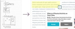
During Someday, we started with sketches, a quick way to make sure all team members are on the same page about functionality and use cases. After sketches, I got to work on an interactive mockup. This is one of the many types of design artifacts we create. It shows the product’s styles with some of the interactions users will see.

Transitioning from sketch to mockup
Building this interactive mockup allowed the team to see how the feature would actually work. How will users move from one suggested reference to another? How will they accept approved references and reject ones that are not relevant?
While I worked through preliminary designs, the developers began to map out how the product would search and find suggested reference points based on previously linked claims in the application. By the end of Someday, we had a rough draft of the user experience and technical proof this could work.
Talking to our users
Before we go through the time-consuming process of building an entire feature, we validate it with our customer advisory panel, comprised of current and prospective users. For this feature, we showed the panel the interactive mockup I had created. In a broad survey, we asked general questions, like how often they would utilize a feature like this. In a smaller user test, we asked participants to complete specific tasks, like starting the smart add tool and accepting a few suggestions.
Usually, we’ll see that users have trouble understanding labels, or the designs aren’t obvious enough, or something in the process just isn’t making sense. For this feature, though, the focus was on its effectiveness. Was it really going to make helpful suggestions? Most users were cynical, thinking that sure, it looked nice in theory, but it couldn’t possibly be that accurate.
We were happy with our interface, but we knew the important part lay on the development side: We needed to build a feature so smart that our users could trust it.
Making it real
One advantage of a nimble team is the ability to collaborate across teams. The whole team reviews the designs and discusses what we’re trying to accomplish, with customer needs and feedback in mind. We discuss all the strange what-ifs, the technical functionality we’re uncertain about, and the amount of development time we’ll have to invest. Only then do we break up the work into actionable tasks and start development.
We began developing the Smart Reference Linking functionality, and once we saw the feature coming together, we planned for a few more changes. What if a suggestion made it difficult to see highlighted text? What if the highlighted text was a little bit off? It’s a bumpy process, but we’ve found it’s more important to be adaptable than to think you’re right from the beginning. With our adaptability, we’re able to create a product our users are happy with. Once we completed development of Smart Referencing, we queued up the feature for our next quarterly release.
Why do all this work?
Good user experience requires input from real users, so Pepper Flow is always adjusting based on what we learn. As we hear about what’s working and what’s not, we make enhancements so that end users will be more productive and, as a result, their processes will be more efficient and cost-effective. This feature will be no different. We’re excited to release it this month, learn how it affects the promotional review process, and discover ways to improve it.


